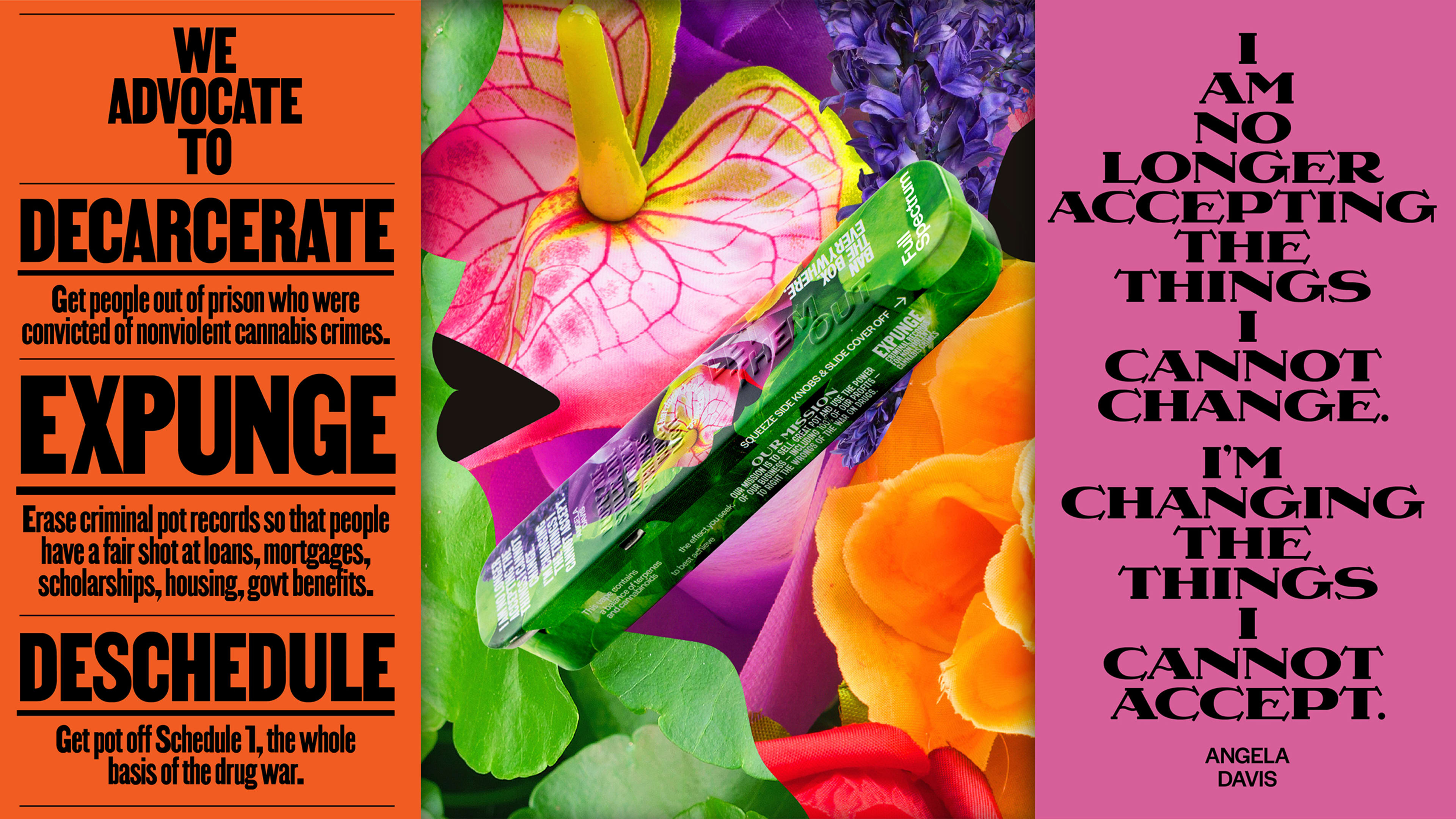
Ben Cohen of Ben & Jerry’s is telling me a story about smoking pot. We’re on Zoom, and he says: “The idea came about when I was on a camping trip with a friend of mine, sitting around a fire, smoking a joint. And we were saying, ‘Wouldn’t it be nice to have pot like the old days?’”
The idea Cohen is referring to is his latest venture, the eponymously named Ben’s Best Blnz, or B3. The just-launched company is a bright, bold cannabis brand that offers low-THC pre-rolls and full-spectrum vapes. Much like his endeavors in ice cream, Cohen set out to use B3’s platform as a conduit for what he refers to as “social benefit.”
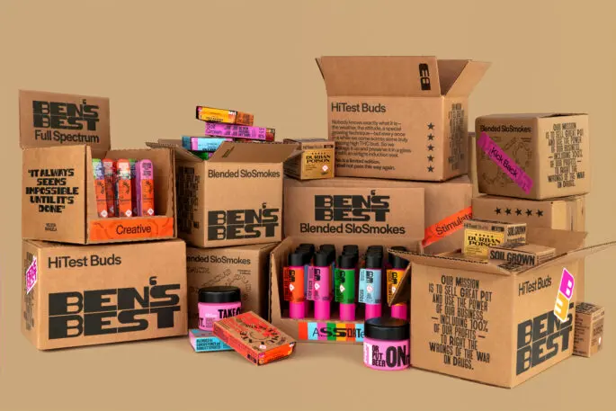
B3 is registered as a nonprofit, with 100% of its profits split between three entities: 10% will go to the Last Prisoner Project, an organization dedicated to freeing individuals impacted by cannabis criminalization; another 10% will be donated to the Vermont Racial Justice Alliance, whose mission is to “secure sustainable power, ensure agency, and provide security for American Descendants of Slavery (ADOS)”; and the remaining 80% will be administered in partnership with NuProject as grants to Black cannabis entrepreneurs.
For Cohen, the latter initiative seeks to rectify the massive gap in generational wealth brought about by the systemic oppression of Black people in the United States. “The average Black family has 1/10th the wealth of a white family,” he says. “I feel like business ownership is one of the best routes to generational wealth.”
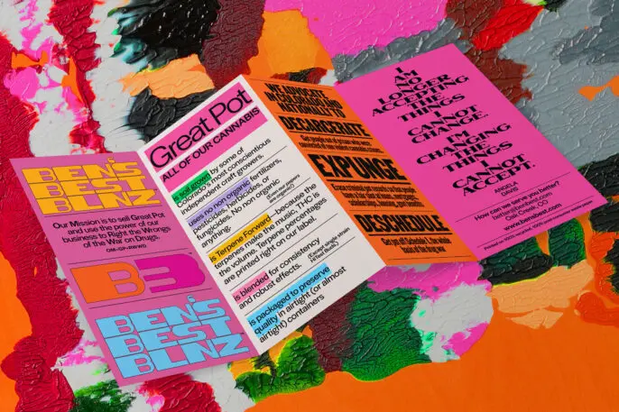
Cohen worked with Pentagram’s Eddie Opara and Jack Collins to design the brand’s visual identity, which includes packaging, website, and merchandise. The brand is vibrantly designed and transparent in its celebration of Black designers and vendors, who are also listed on B3’s website. As a Black designer who is well aware of the industry’s whitewashed makeup, Opara was conscious of involving other Black creators in building the brand’s visual language.
Tré Seals, founder of Vocal Type, designed the brand’s three primary typefaces—the expressive Bayard, Martin, and Eva. Each typeface is inspired by “demonstrations that define what equity could be,” says Opara. Meanwhile, B3’s supporting type, Halyard, is from Darden Studio and shows up across the tins and website for descriptions and product details. “Everything has a reason,” says Opara of the team’s design choices.
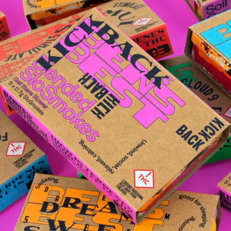
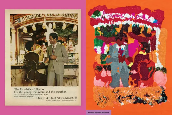
The brand’s packaging spotlights the work of Dana Robinson, whose Ebony Reprinted series recontextualizes 1950s and ’60s ads from the magazine by smearing and layering paint into monoprints. “I remember as a child in Britain, my cousin used to bring Ebony to my house, and this is the only time I would see Black people in adverts,” Opara says.
Opara commissioned Robinson to create a new piece for the brand, using an old suit advertisement set in an ice cream parlor (a nod to Cohen’s roots). The resulting multicolored image is splashed across the tins for B3’s SloSmoke product and also is sold as a poster.
Opara also created a piece of art that lives as merchandise on the website. Opara’s collage design features a Black man, his hair made of purple hyacinths and his face comprised of other florals, wearing an orange incarceration jumpsuit. “Hyacinth symbolizes a sense of forgiveness, of innocence, of joy, and beauty—and I wanted that to be applied to a Black male,” Opara says. The goal is to eventually bring other Black artists into the fold for packaging and merch.
The resulting brand is symbolically and visually rich, but B3’s most striking gesture is the copy that covers both the website and product packaging. Printed on the tins for B3’s low THC pre-rolls are quotes by renowned abolitionist Angela Davis and the late former president of South Africa, Nelson Mandela. The power of the quotes, combined with what Opara describes as “authentic embossing,” creates “something to treasure, something you remember.”
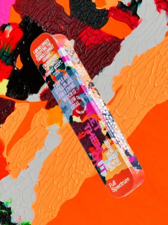
These tins, no doubt eventually strewn about the homes of tokers, are vivid reminders of the history of this substance—who it benefits, and who it has incarcerated. Referencing the classification of marijuana as a Schedule 1 substance under the Controlled Substances Act, the text on B3’s HiTest Bud jars reads, “Take Pot Off Schedule 1, or Put Beer On It.”
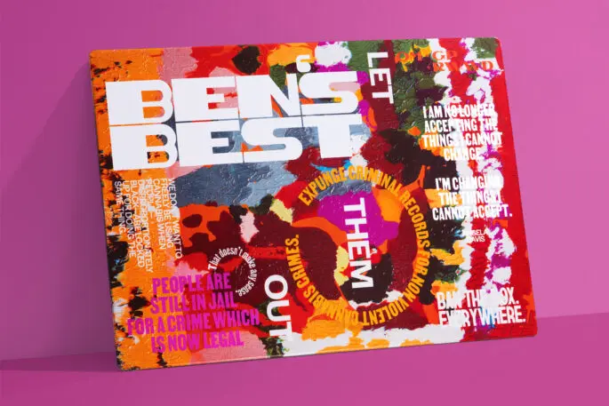
“Schedule 1 is the whole root of the war on drugs,” Cohen says of Nixon’s campaign that disproportionately targeted Black people and informed the country’s current issue of mass incarceration (Black people historically have been arrested for using cannabis at four times the rate of white people). “Schedule 1 is supposed to be for drugs that have no medical value and have a high risk of addiction,” Cohen adds, “which does not apply to pot, but it does apply to beer.” With its mission to “sell Great Pot and use the power of business to Right the Wrongs of the War on Drugs,” B3’s products have become traveling campaigns for decarceration, expungement, and de-scheduling.
And when asked if the brand plans to work with formerly incarcerated artists or vendors, Cohen’s reply is sincere and upfront: “There ain’t no box on our applications!”
Recognize your brand’s excellence by applying to this year’s Brands That Matter Awards before the early-rate deadline, May 3.
