People love a good design trend story (guilty!). When it comes to book covers, it’s a delight to read about Frappucino unicorns, stacked silhouettes, and overgrown botanical borders. The only problem: Commercial trends make finding the really interesting stuff that much harder—those covers that stop you in your tracks as exceptional standalone pieces of design.
So, we turned to a panel of some of the best designers in publishing today to share their favorite cover from 2022 that broke the mold and made our bookshelves all the better for it.
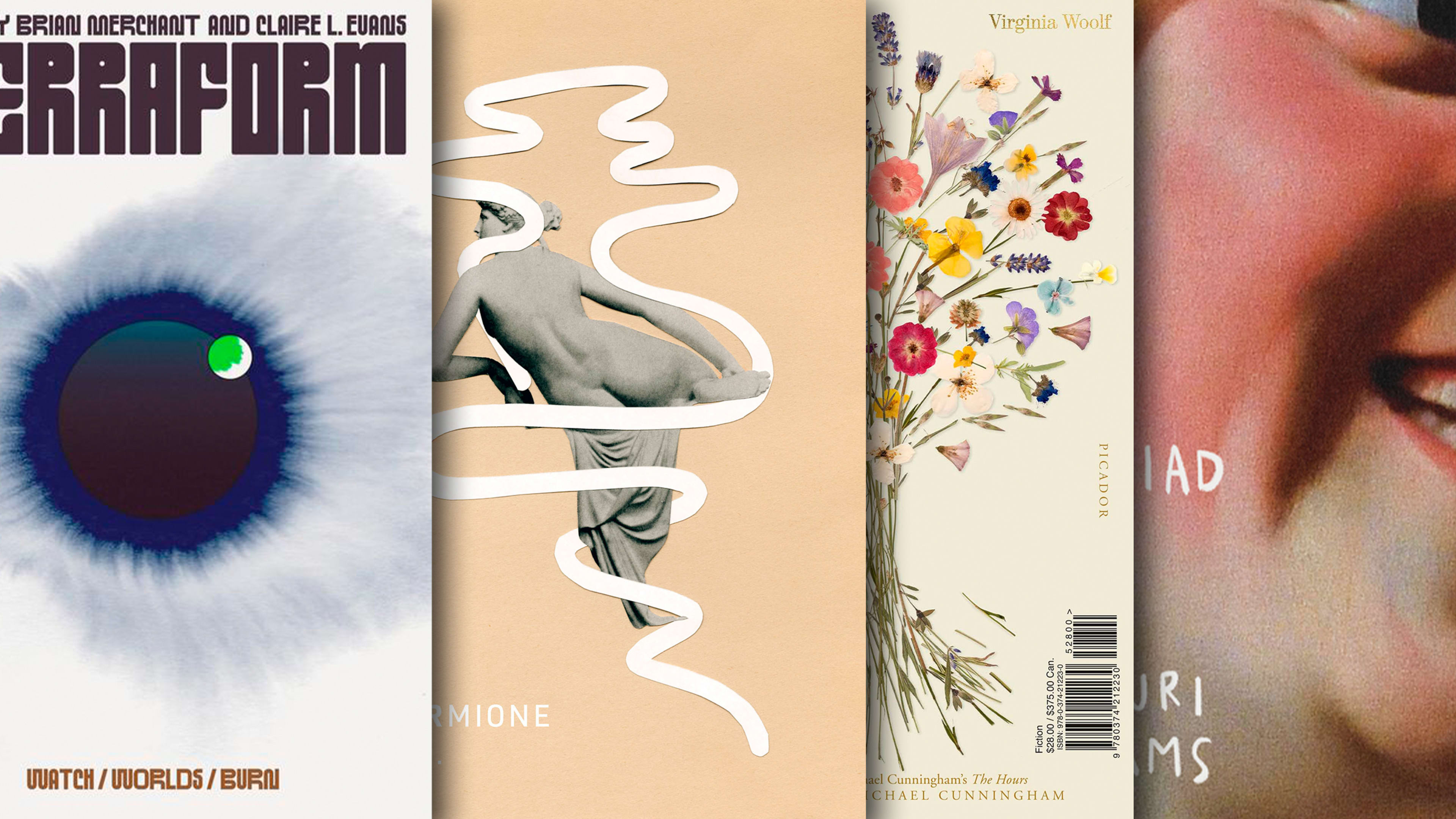
Terraform, designed by Chloe Scheffe
Selected by Alicia Tatone
“This cover feels simultaneously classic and entirely new. It’s slightly reminiscent of 1970s science fiction covers (albeit much more restrained), and yet I’ve never seen anything quite like it. That custom type! That illustration! Is it a world? An eye? Something else? All of the above? As a reader, I don’t typically gravitate toward sci-fi, but this cover is so compelling that it made me immediately want to buy the book.”
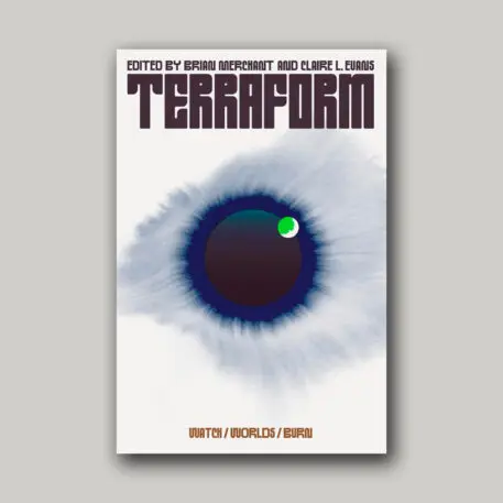
No Land in Sight, designed by John Gall
Selected by Henry Sene Yee
“There were so many eye-catching covers this year, but the one that constantly stood out for me because of its stunning simplicity, beauty and mystery was designed by John Gall: No Land in Sight. In a sea of gorgeous covers exploding with kaleidoscopic colorful backgrounds, with elements twisting and intertwining, with the title and author type set in sans-serif condensed fonts, Gall’s cover was refreshing for its clean layout, tasteful typography, elements that are balanced and non-overlapping, in an austere monochromatic palette. Timeless.”
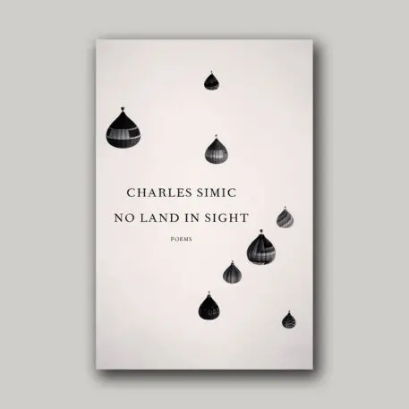
Mrs. Dalloway & The Hours, designed by Pablo Delcan
Selected by Grace Han
“The whole package is stunning and smart—words I use a lot to describe Pablo Delcan’s works. The covers evoke introspectiveness and intimacy in such a beautiful way. Everything from the type to the flower placement feels considered and intentional. I love how both sides mirror and work with each other visually and conceptually.”
Ascesis, designed by David Pearson
Selected by Jack Smyth
“This cover is a feast of dualities: both a figurative scene and an abstract texture; a figure seen far off in the distance and a marbled paper viewed at almost 1:1 in scale; a formal, rigid, block colored layout, and a big, expressive interruption in the middle. The slightly muted colors are so refreshing, especially in a year when we’re reaching peak ‘pop,’ and David shows us here that you don’t need neon Pantones or massive type to create a big, bold, absorbing cover. I love that the type is almost pushed to the peripheries by the sprawl of the illustration, as if it’s something that’s happened over centuries; it makes everything feel massive in scale. Also, the silhouette of the figure is from a photo of the author, which is a perfect Pearson point of detail! There are worlds existing in this book cover, and I find it very easy to get lost in them.”
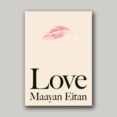
Love, designed by Stephanie Ross
Selected by Dominique Jones
“My favorite cover this year is Love by Maayan Eitan. It’s simple, sensational and clever. The frowning pink lip stain is mysterious and affectionate and grabs you in, and I want to know more! Love it!”
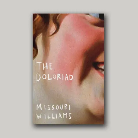
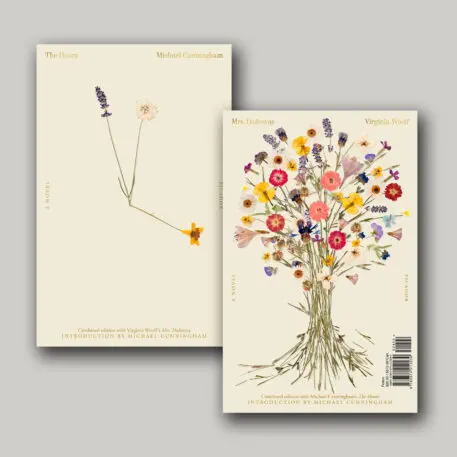
The Doloriad, designed by Luke Bird
Selected by Daniel Benneworth-Gray
“It’s impossible not to be drawn to Luke Bird’s cover for Missouri Williams’ debut novel The Doloriad when it’s staring out from a bookshop display. It’s an expression of . . . what? Dead Ink Books’ blurb describes it as ‘a document of depravity and salvation.’ The ambiguity is intriguing. I dread to think how many iterations this design went through. I imagine this particularly effective crop of Gerrit van Honthorst’s 1634 painting ‘Woman Tuning a Lute’ is one of many that live on Bird’s hard drive.”
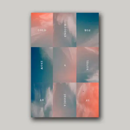
Cold Enough for Snow, designed by Janet Hansen
Selected by Na Kim
“As book cover designers (or designers in general), we’re all faced with the same challenge: presenting something familiar in a new and unexpected way. How many times have we seen photos of a sky or sunset on a book cover? Here, Janet takes an image that is seemingly exhausted and successfully presents it from a fresh perspective. This cover is beautiful in its simplicity, and it’s something Janet does best. I always look to her work to find inspiration in ways to create designs where ‘less is more,’ and this cover is a prime example of her brilliance and mastery of great minimalist design.”
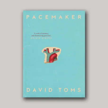
Pacemaker, designed by Anna Morrison
Selected by Holly Ovenden
“Anna Morrison has been consistently pushing the bar year after year with her beautiful book cover designs. It was hard to choose just one of her covers, but for me, Pacemaker by David Toms stood out. The book is an account of human fragility, and confronting the reality of living with a rare heart condition. The design itself draws you in via a small cut-out section of a vintage illustrated anatomical heart. Showing just the top two veins and arteries, the image has been cleverly placed off center on a lightly textured pale dusty blue background. The classic type layout frames the artwork perfectly, giving it both breathing space and impact.”
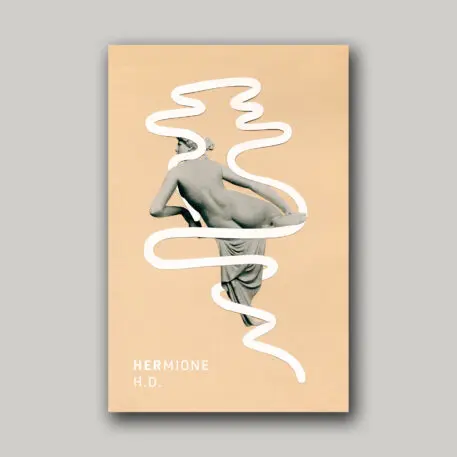
HERmione, designed by Thomas Colligan | Rodrigo Corral Studio
Selected by Charlotte Strick
“I adore the deceptively simple solution for the New Directions reissue of HERmione. . . . The modernist lock-up of classical statue and rippling white line begs many questions: Is this goddess-muse stepping in or out of the trippy border? Is this curious line an abstraction of a serpentine snake or a hard-edged column of smoke? Do its exaggerated curves prop her up—or hold her back? Has she recently freed herself from its bind, victorious? Or has the cover designer’s scissors merely mimicked the low-slung loops of stone drapery (long since slipped from this woman’s muscular derriere) in a fluid, ornamental gesture? In her modified Tree Pose, possibly for all eternity, the woman’s fixed gaze is directed toward her backstory (the book’s spine), rather than facing her future. There’s clearly nothing simple about Thomas Colligan’s spare design.”
Recognize your brand's excellence by applying to this year's Brands That Matters Awards before the early-rate deadline, May 3.
